Ingrediants
For Churros
1/2 cup water
1 tablespoon white sugar
1 pinch salt
1 tablespoon coconut oil
1 cup all-purpose flour
Frying oil
For Sugar Coating
2 tablespoons white sugar
1 tablespoon strawberry powder
For Chocolate Sauce
1/4 cup chocolate chips
1 teaspoon coconut oil
Instructions
In a pot, heat the water, sugar, salt and coconut oil until the sugar has dissolved. Take the pot off the heat and add in the flour. Stir to combine. Let it cool down until cold enough to touch.
Fill the churro dough into a pastry bag with a star tip. Pipe 5″-ropes onto a parchment paper and combine two ropes for each heart.
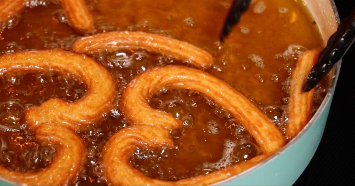
Heat the frying oil in a pot (just enough so that the churros can swim; make sure there’s enough room in the pot to prevent it from spilling over). And carefully add the churro hearts (work in batches). Let them fry for about 3-4 minutes until golden and crispy. Transfer the hearts onto a paper towel to remove excess oil. (It’s best to try a churro heart if they are cooked all the way through, if they are raw inside then the oil is too hot. Reduce the heat.)
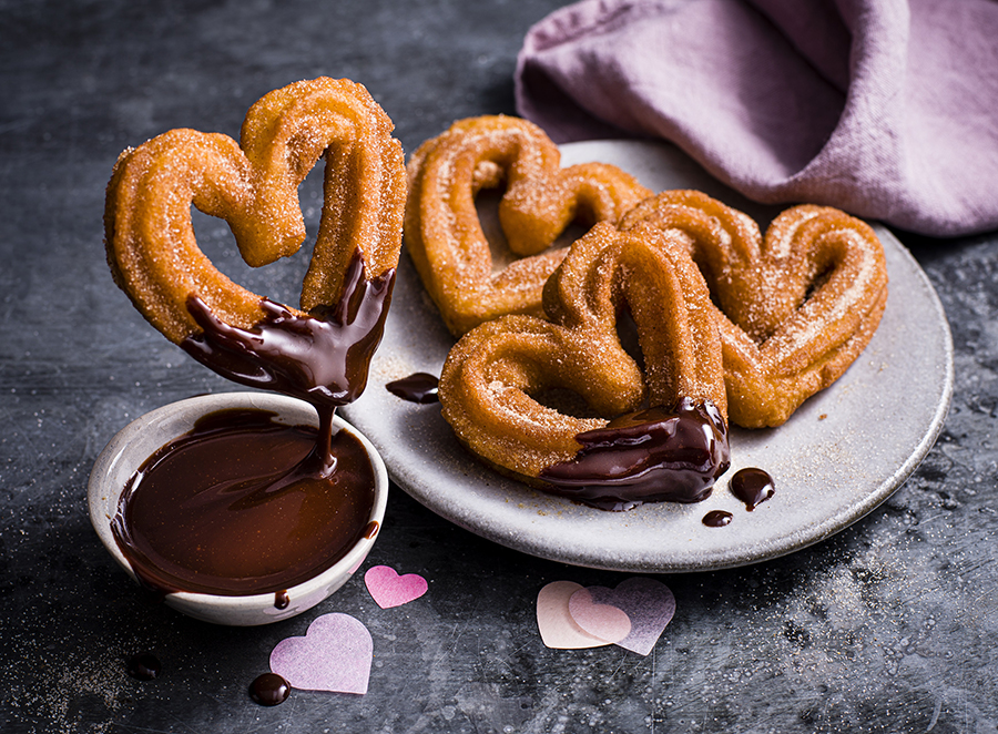
For the strawberry sugar coating, combine the sugar and powdered strawberries on a deep plate. Coat the churros with the strawberry sugar.
For the chocolate sauce, heat the chocolate chips and coconut oil in a double boiler until melted. Serve with the churros!
Inspiration
From recipes
I selected this recipe website because I like how there is a clear typographical heirarchy and sans font selection within the instructions which makes it easier to follow and read. I like how the recipe doesn't overwhelm you with information at the top and includes images throughout so user's can follow along to see what their food should look like.
I enjoyed this recipe website because instead of providing an extended summary that would extend scrolling for the user, they dive straight into the recipe along with the images being housed within the carousel. I also liked how clean it look with the larged spaced margins and the use of icons in the recipe tip/reviews.
I chose this recipe because I liked how it accounted for more visual users that have time and want to follow along step-by-step with images and extended instructions. Although the details about the recipe add more scrolling, the inclusion of the "Jump to recipe" button allows user's to choose if they want to read that information.

From other sources
I selected this website because I liked the effect of the text on top of the photo of food from the restaurant, making it look very clean and modern. In addition, the card on the side, that contains important information like location, is fixed so that users wouldn't have to keep scrolling to the top.
I chose this website because I liked the similar suggested recipes at the bottom so that users don't have to leave the page to find new options. I also liked how the information has a good amount of space between the body and the header so the text doesn't feel crammed, also a result due to the subtle lines that divide the content.
I chose this website because the background color behind the heading and hero image creates a nice contrast as well as being a cool stylistic element. In addition, the descriptions of the contributors at the bottom are divided by lines which makes it look simplistic and readable as well as takes up limited space.

